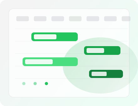
Color-coded areas mirror the floor plan so supervisors assign coverage without spreadsheet roulette.
Floor-native coverage
Areas inherit colors from the seating map so leads scan gaps the same way they do on event night.
Peak overlays
Load-in and show-time staffing bands stack visually, fewer double-books at choke points.
One publish for everyone
Union stewards, contractors, and house staff see the same frozen roster after publish, no forked PDFs.
“Our floor isn’t rows and columns, it’s rings, pits, bars, and ingress. Finally the roster matches how we actually walk the building.”
Venue Operations Lead·Mid-size arena (anonymous)
12
Zones modeled on one map
~15 min
Handoff time between leads
Built for the floor, not the workbook
This venue schedules twelve simultaneous zones during concerts, bars, VIP decks, ingress pods, and back-of-house runners. Legacy tools forced everything into generic “departments,” so supervisors mentally translated coordinates every shift swap.
How Heyshift maps to the building
Planners define areas that mirror signage and radio channels. Assignments inherit those labels end-to-end: mobile alerts, printed runsheets, and escalation paths all speak the same language.
Supervisors drag coverage inside each zone while Heyshift enforces minimum headcount and certification tags per slice of the map, without collapsing everything into one overloaded grid.
After publish
Event leads freeze the roster at publish; changes route through a short approval chain so security and talent unions stay aligned. The operational story here is spatial fidelity, every paragraph should reinforce that this customer thinks in diagrams, not spreadsheets.